Dark Mode UI Adaptation
Tools: Figma , ProtopieIn today’s digital landscape, dark mode has become a staple of user interface design, offering users an alternative visual experience that reduces eye strain and enhances readability in low-light environments. Recently, I undertook the task of translating a UI design to dark mode. Here, I outline my process, the resources I leveraged, and the key considerations to ensure the design met accessibility standards and best practices.
Research Phase
To approach the assignment systematically, I began with extensive research. This included:
Web Articles and Resources:
- Exploring articles and tutorials on dark mode design principles.
- Reviewing examples of successful dark mode implementations in popular applications.
WCAG Guidelines:
- Studying the Web Content Accessibility Guidelines (WCAG) to understand the requirements for color contrast and readability.
- Focusing on the recommended contrast ratios for text and interactive elements.
Dark Mode Best Practices:
- Learning the main principles of dark mode design, such as avoiding pure black (#000000) and using dark shades of blue or gray to create a comfortable viewing experience.
- Understanding the concept of elevation, where darker backgrounds indicate depth, and lighter tones are used for elevated surfaces like cards or dialogs.

Design Translation Process
Choosing a Color Palette I selected the dark blues from the existing color palette to serve as the foundation for the dark mode design. These colors provided a balance between aesthetic appeal and functional readability. Subtle variations in tone were introduced to differentiate between background layers and interactive elements.
Applying Dark Mode Principles
- Avoiding Pure Black: Instead of using pure black, I opted for dark blue shades to reduce glare and create a more visually appealing interface.
- Maintaining Elevation: Elements like buttons, cards, and modals were designed with slightly lighter shades to simulate elevation and provide visual hierarchy.
- Highlighting Interactivity: Interactive components, such as buttons and links, were given accent colors to make them stand out against the darker background.
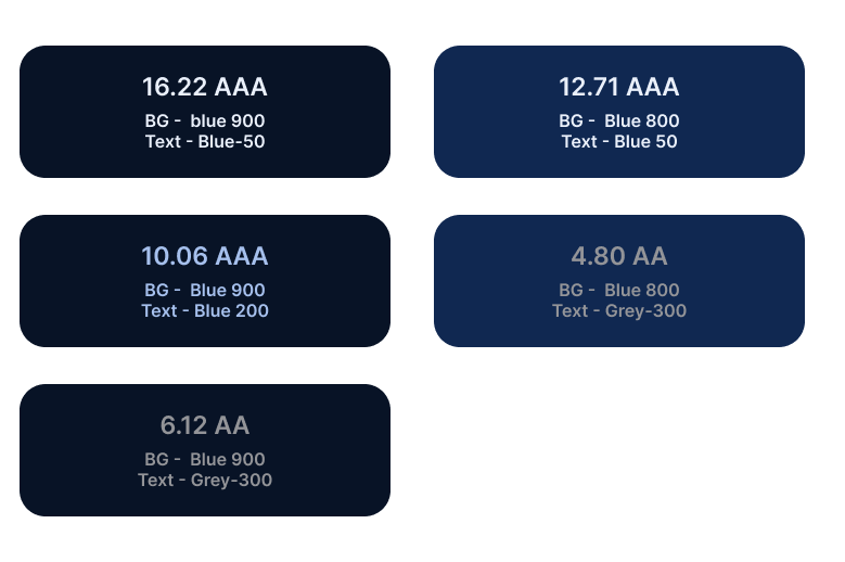
Ensuring Contrast Compliance Using contrast measurement tools, I evaluated the contrast ratios between text and background in various scenarios. For body text, headings, and interactive elements, I ensured compliance with WCAG’s minimum contrast ratios:

Lessons Learned Translating a UI design to dark mode is more than just inverting colors; it requires thoughtful consideration of contrast, hierarchy, and user comfort. Key takeaways from the process include:
- Color Selection Matters: Choosing the right shades is critical to creating a visually appealing and functional dark mode.
- Contrast Compliance is Non-Negotiable: Ensuring adherence to WCAG guidelines guarantees an accessible and user-friendly design.
Designing a dark mode interface is a rewarding challenge that combines creativity with technical precision. By following established guidelines, leveraging contrast tools, and prioritizing user comfort, designers can create dark mode experiences that are both beautiful and functional.